Wayfarer Design
Designing how travelers discover what's next through personalized, intuitive exploration.
Role - Product Designer
Timeline - 4 Weeks
Platform - Mobile, Desktop
Deliverable - High Fidelity UI & Prototype
01
Overview
Planning travel often starts with a simple but difficult question: “Where should I go?”
Most travel platforms assume users already have a destination in mind and focus on booking logistics such as flights and hotels. However, many travelers, especially younger travelers, are still in the inspiration phase of planning. They want to browse, explore, and discover destinations that align with how they want to experience the world.
Wayfarer is a conceptual travel discovery platform designed to address this gap. The platform analyzes users' preferences and past travel experiences to surface destinations, hidden gems, and unique adventures around the world using AI-driven insights. Young travelers can ultimately find their next destination through personalized exploration.
02
The Challenge
Design a landing page that translates Wayfarer's brand and vision into a compelling digital experience. Communicate the mission, spark wanderlust, and invite users to explore destinations tailored to their interests.
03
Design System
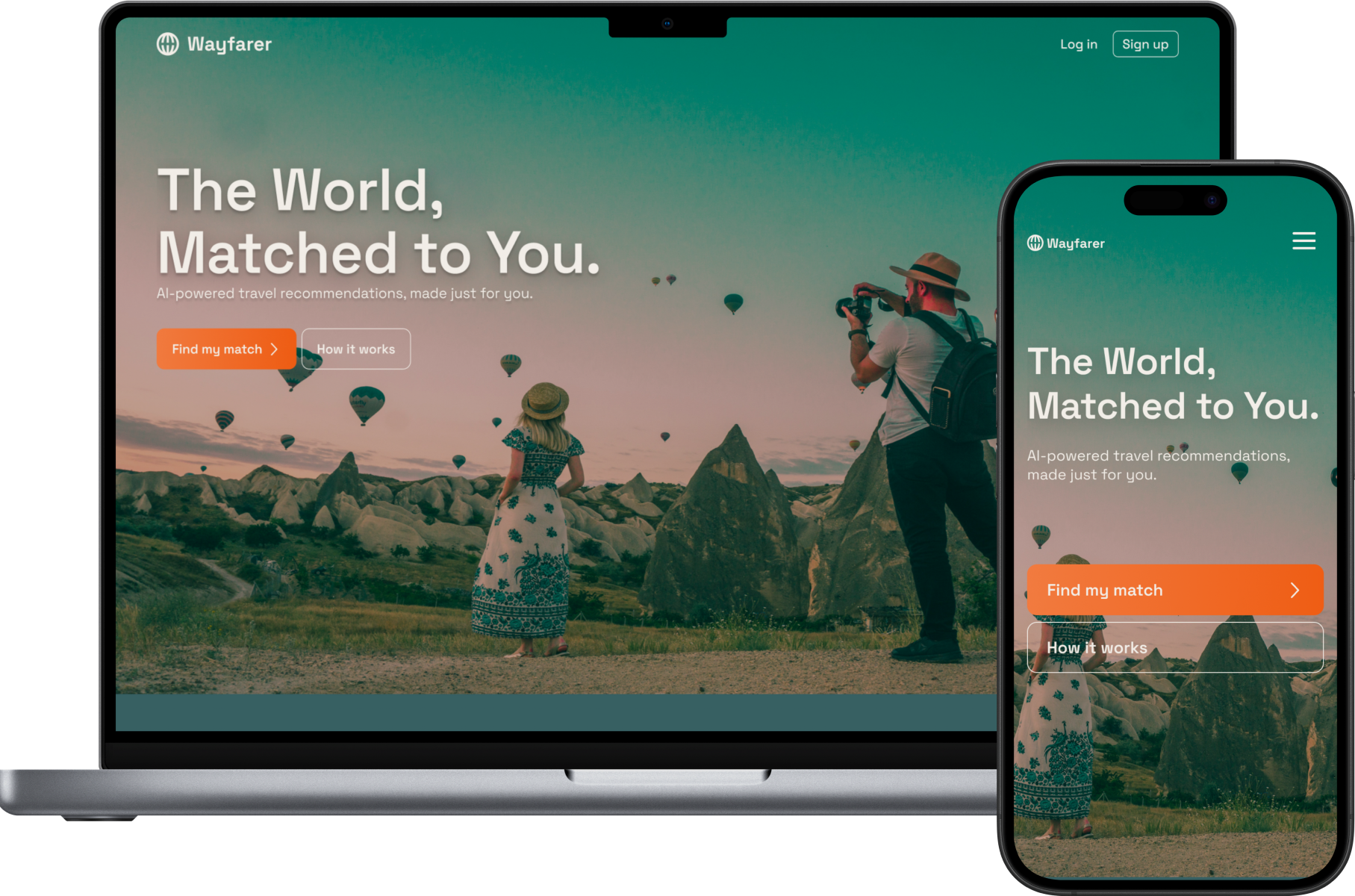
I assembled a color palette that captures the attention of youthful, adventurous travelers. Teal evokes discovery, travel, and openness to new experiences. Orange adds energy, contrast, and draws attention to key moments.
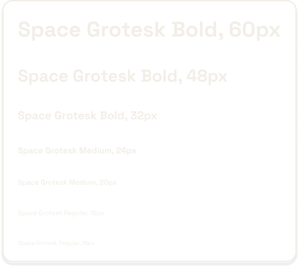
I chose Space Grotesk for its modern, approachable feel and built a clear type scale to establish strong visual hierarchy and cohesive readability.
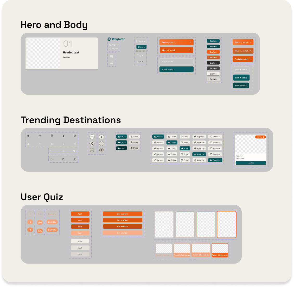
I structured the design around reusable components to maintain visual consistency, streamline iteration, and support scalability.
04
Design Process
Hero Iteration
Wireframe
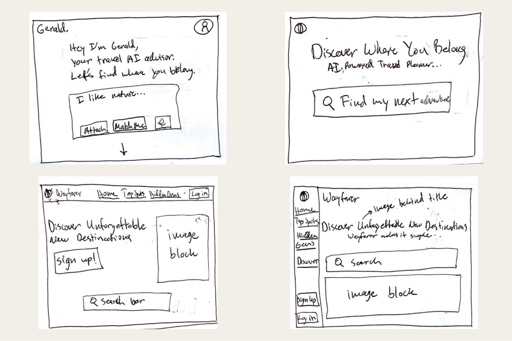
Explored a couple different hero layouts including a vertical navigation bar and a travel search engine style design.
Low Fidelity
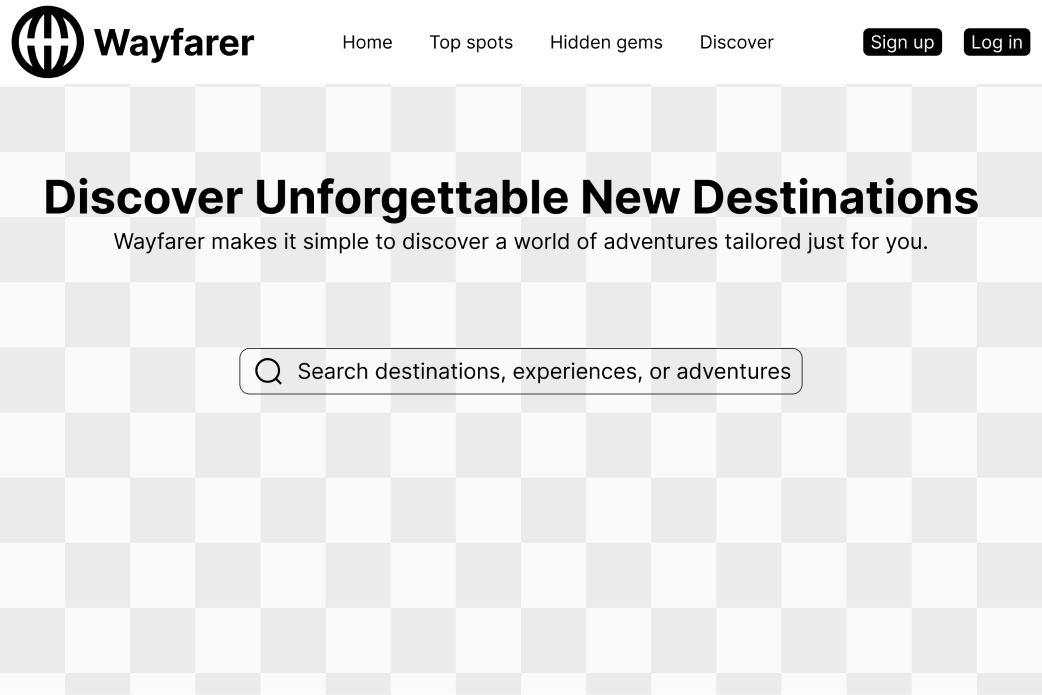
Focused on establishing clear visual hierarchy and spacing. I initially chose the search bar as the primary call to action to encourage immediate exploration.
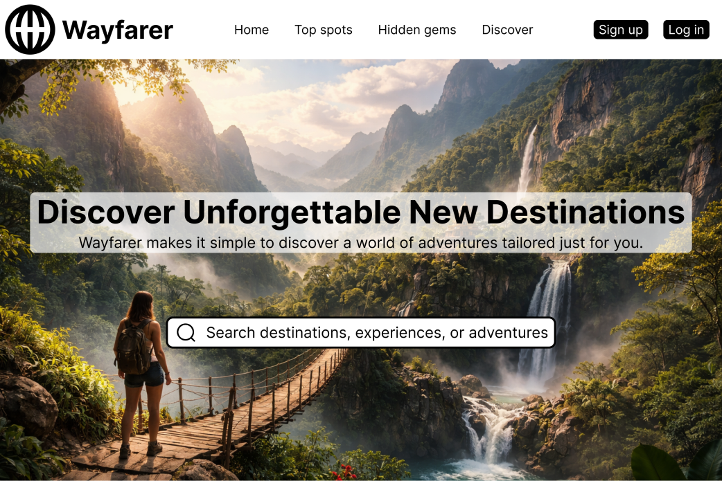
High Fidelity V1
Refined the hero with stronger messaging and applied typography, color, and contrast to create a more impactful visual.
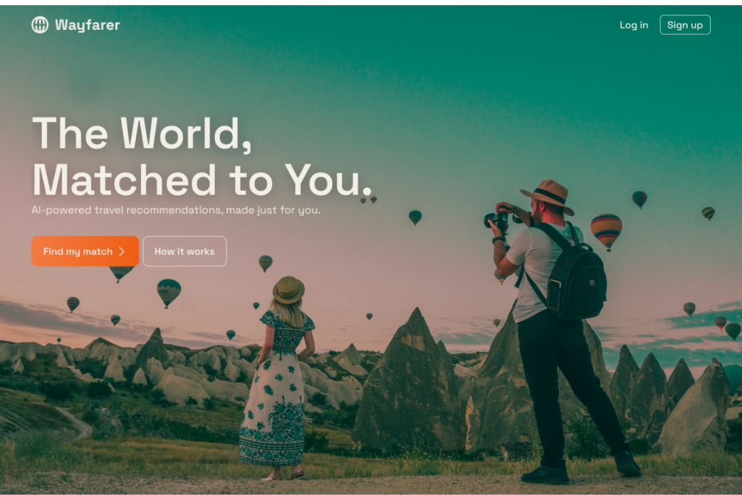
Mid Fidelity
Experimented with AI-generated imagery by prompting with the brand's values and tone to find a visual direction for the hero.
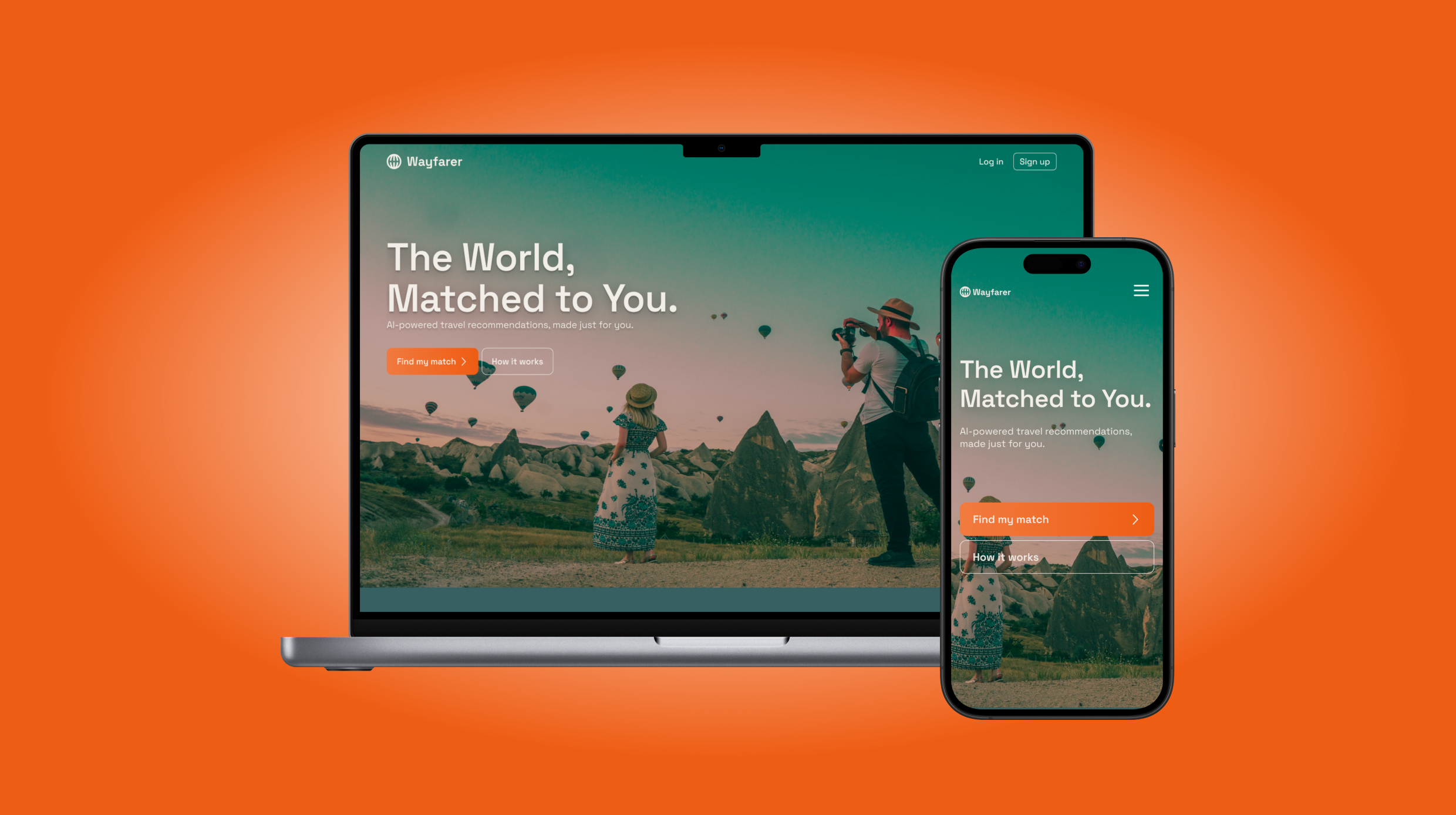
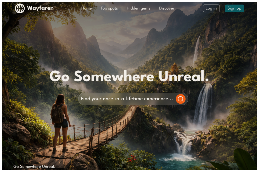
High Fidelity V2
Pivoted to a minimal, image-driven hero. Removed navigation links and reduced visual complexity to create a more focused entry point. Also emphasized bold, high-contrast CTA buttons to drive engagement.
User Quiz Iteration
Wireframe

Structured the form into steps with clear grouping, consistent input patterns, and progressive disclosure.
Mid Fidelity
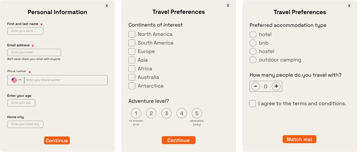
Structured the form into steps with clear grouping, consistent input patterns, and progressive disclosure.
User feedback revealed friction and cognitive overload. The form felt too tedious and input-heavy.
User feedback revealed friction and cognitive overload. The form felt too tedious and input-heavy.
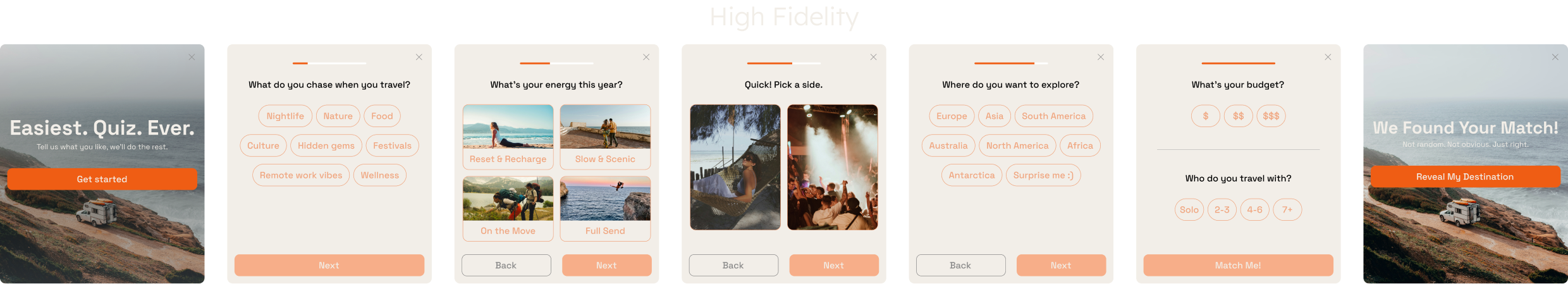
Reframed the experience from a data collection form to a guided, quiz-based discovery. Replaced text inputs with tap-based selections and split the flow into step-by-step screens. Also optimized for mobile by spacing elements for readability, increasing touch target size, and limiting each screen to a single focus.
05
Final Design
The final design delivers a responsive travel experience that guides users from initial discovery to personalized destination matches.
The Trending Destinations module serves as the centerpiece of the discovery flow. Users can filter by travel vibes and swipe through curated destination cards to easily discover places that match their interests.
Selecting the CTA launches a short preference quiz that introduces Wayfarer's core product. Simple inputs capture key travel preferences and power the AI engine to generate a personalized destination.